Screenshots of an iPhone showing the broken background and the working background
Updated: 22nd Feb 2010
I experienced a slightly odd bug in the latest version of mobile Safari on iPhone where it was shrinking large background images applied via CSS to fit within the confines of the screen. Not finding anyone else who has written about this problem I thought I’d share my findings.

Firstly a bit of background, the company I am working for at the moment recently released a real-time CSS editor (of sorts) which I built that allows customers to style their sites using nothing more than uploaded images and some UI controls – for more details on that you can see a video of it in action on this blog post and some of the amazing results that customers have been able to achieve with it.

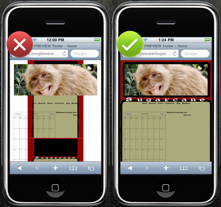
Yesterday one customer reported an issue where a large background image (1800×2520) was being shrunk on the iPhone. I did quite a lot of investigation and to cut a long-ish story short I discovered that there is a tipping point where the total pixel-area of an image causes mobile Safari to resize the image. This tipping point appears to be at 2,000,001 pixels.

Read on for a bit more of a breakdown of my experiment results.

To debug this issue I looked at the pixel size of some of our larger background images that were working fine on the iPhone and then tried various sizes to see what the results were. My experiments are shown in the table below (in the order I performed them).

Width  Height  Pixel area  iPhone shrinks background
1400 1200 1,680,000 No
1200 1600 1,920,000 No
1200 1800 2,160,000 Yes
1200 1700 2,004,000 Yes
1200 1650 1,980,000 No
1200 1675 2,201,000 Yes
1200 1666 1,999,200 No
1666 1200 1,999,200 No
1667 1200 2,000,400 Yes
500 4000 2,000,000 No
500 4001 2,000,500 Yes

There were further tests in between but I won’t list them all for your sanity but my tests seems to say that it didn’t matter on the width or the height of the image just the total pixel area. E.g. a very wide image < 2,000,001 works just as a very high image does. At 2,000,001 pixels or larger they get shrunk. Note I didn't get it right down to 2,000,001 pixels and this is just an educated guess that it is the actual tipping point.

I’m going to submit this as a bug to Apple I’m not sure what is causing this but another guess of mine is that 2,000,000 is the maximum area that the renderer will handle/cache (you can see this in effect when you scroll around on mobile Safari how it re-draws the page) and so is getting enforced on the background image some how.


Update: 22nd Feb 2010
It seems I should have RTFMed. Apple got back to me with regards to the bug and pointed me at the Known iPhone OS Resource Limits in the Safari Web Content Guide which says:

  • The maximum size for decoded GIF, PNG, and TIFF images is 3 megapixels.

    That is, ensure that width * height ≤ 3 * 1024 * 1024. Note that the decoded size is far larger than the encoded size of an image.

  • The maximum decoded image size for JPEG is 32 megapixels using subsampling.

    JPEG images can be up to 32 megapixels due to subsampling, which allows JPEG images to decode to a size that has one sixteenth the number of pixels. JPEG images larger than 2 megapixels are subsampled—that is, decoded to a reduced size. JPEG subsampling allows the user to view images from the latest digital cameras.

Emphasis added.

Comments

There have been 47 comments so far, join the discussion.

1. Jared Starkey - 20th Apr 2010 - 2:59 pm

You sir, are a saint for figuring this out. I sincerely appreciate you blogging this, and will link to your article.

[...] DEfusion.org.uk " Shrinking large background image bug in iPhone Safari I experienced a slightly odd bug in the latest version of mobile Safari on iPhone where it was shrinking large background images applied via CSS to fit within the confines of the screen. 3 megapixels looks to be the limit. (tags: mobile safari quirk bugs) Posted on April 26, 2010 [...]

3. links for 2010-04-26 | Iona.LABS - 27th Apr 2010 - 6:20 am

[...] DEfusion.org.uk " Shrinking large background image bug in iPhone Safari I experienced a slightly odd bug in the latest version of mobile Safari on iPhone where it was shrinking large background images applied via CSS to fit within the confines of the screen. 3 megapixels looks to be the limit. (tags: mobile safari quirk bugs) [...]

4. Stuart M - 27th Apr 2010 - 2:53 pm

A great post. Thank you very much for writing this article, it’s just saved me a load of work.

Thanks!

5. Dennis K - 15th May 2010 - 3:14 pm

Thank you for posting this. I have been pulling my hair for the last two days over this.

6. nadia - 29th Jun 2010 - 8:24 am

same issues on ipad. thank you soo much for posting this!

7. Jochen Gülden - 11th Jul 2010 - 4:24 pm

Thanks a Lot for sharing! Very helpfull.

8. John Myers - 12th Aug 2010 - 3:35 pm

I thought I was the only one having this problem! I had discovered this bug on my own, and had come to the same conclusion about file size. I took my jpgs that were being “safari” downsized, and converted them to gifs. This of course, resulted in a smaller sized file, and caused the bug to disappear. The solution I implemented was to just break the one large jpg into two smaller ones (my large jpg files were being used as background images, and needed to be the size I had set). In the CSS, I just referenced them as such. Works nicely, but slows things down due to a second HTTP request when the page is loaded. Thx for the nice break down on file size here. I still say this is a bug, I don’t care what Apple says. :-)

9. tomhodgins - 20th Aug 2010 - 6:34 pm

Thanks a lot for figuring this out dude, this will be a great help to me – I’m trying to modify a tumblr theme for a charity’s website and the background image I’ve used is just too large.

Thanks to your handy guide I’ll reduce it to a known ‘safe’ size!

Cheers from Canada!

10. mvw - 21st Aug 2010 - 8:24 pm

Am I glad to finally run into your website… almost cooked my brains out last two days trying to keep my new site’s background (1920×1080) from scaling on Mobile Safari. Thanks for posting your extensive image size testing results, makes the problem a lot more clear! Now I can finally give my head some rest… it’s all Steve’s fault! ;)

11. Alex - 6th Sep 2010 - 5:58 am

Thank you, thank you… saved me hours of work, as I just ran into the same thing.

12. Mladen - 19th Sep 2010 - 4:53 pm

You helped me a lot!
Thanks!

13. Reed - 21st Sep 2010 - 9:45 pm

Thanks for this post. It helped! Saved me lots of testing time to figure it out myself.

14. vibi - 22nd Sep 2010 - 4:54 pm

Wow, I thought I was going crazy! Gratitudes to you for solving this. That’s about the craziest bug ever.

15. Web Design Gold Coast - 22nd Sep 2010 - 11:35 pm

Agh!! This is so good! I was playing around with text-resize CSS and nothing was working. Then I’ve done as you’ve said and changed the background image size which has worked!
Thanks so much for this resource.

16. false - 15th Nov 2010 - 10:39 am

nice post ! thanks

[...] är en blogpost som förklarar lite mer detaljerat: http://www.defusion.org.uk/archives/2010/02/19/shrinking-large-background-image-bug-in-iphone-safari…; Taggar: design, utveckling ← För ful för en [...]

18. Scott - 19th Nov 2010 - 10:22 pm

It looks like saving over 2 megapixel images as progressive jpgs overcomes this limitation.

19. InfinityCyberworks - 30th Nov 2010 - 4:22 am

This was driving me a bit crazy – been trying to get a commerce site to look “right” on iphone and THIS was the problem!

Any workaround yet ? (grin)

20. Daish - 30th Dec 2010 - 1:17 am

Thanks a bunch. IM happy i now know why my pages are getting distorted…. but i didnt wanna change the size. i hope they fix this problem soon…. but at least no i can get it fixed in the short term.
bravo!

21. Kamchatka - 12th Jan 2011 - 3:12 am

So, let me get this straight…you build a site for the nice new shiny 2560px wide screens that Apple sell as standard with a full-screen background image and this will break on other Apple products like the iPhone and iPad? Are Apple really that stupid?

22. Kamchatka - 12th Jan 2011 - 5:06 am

I didn’t say thanks for your post by the way. Meant to, it saved me a lot of wasted experimentation. Here’s something I discovered. I split the background into two. Took it out of the body background CSS and placed the two images in the foreground behind the mainContainer using width=50% and positioned absolutely left and right respectively. The problem with this was that I got a hairline fracture between the two in Chrome, Safari (windows) and Opera. I nudged the right image in by 1px. This solved the issue in Chrome and Safari but not Opera. It also didn’t have an adverse effect in FF and IE (7 and 9) either. So with Opera being the only casualty, this seems the best results under a damage limitation regime. Would be interested in a better suggestion if anyone knows of one.
Thanks again for the post.

23. Trolleymusic - 6th Feb 2011 - 2:09 am

You are amazing. I was having issues with my lightweight, but large PNGs not showing up in the background of my site. Now, as long as they’re less than 3MP it’s fine.

Thanks!

24. Bernard N - 14th Feb 2011 - 5:15 am

Very, very nice hint. THX a lot for this. Keep good work!

25. BenKN - 25th Feb 2011 - 10:44 am

Thanks so much! I’ve suffered this seemingly random issue for awhile and could never figure out what was wrong. Really appreciate the article!!!

26. Eric - 9th Mar 2011 - 2:00 pm

I changed Widht 1732 x Height 1155 pixels (= 2000460 pixels) in 1732×1154 pixels (= 1998728). And in the code of my Blogspot-blog I changed ‘no-repeat’ in ‘repeat’. Now it’s OK, also on my iPhone !!!!

http://bondtehond.blogspot.com/

(HTML/Javascript-Widget)

body {background-image: URL(http://img638.imageshack.us/img638/8844/nuopsite2.jpg); background-position: center; background-repeat: no-repeat; background-attachment: fixed; }

changed in:

body {background-image: URL(http://img638.imageshack.us/img638/8844/nuopsite2.jpg); background-position: center; background-repeat: repeat; background-attachment: fixed; }

THANK YOU VERY MUCH !

27. Roel - 24th Mar 2011 - 10:50 pm

Save your image as ‘Progressive’ in Adobe Photoshop, instead of ‘Optimized’.

You can still use the full size and it will be shown correctly on your iPhone, or iPad.

I figured this out when I accidently saved the image as ‘progressive’. Major breakthrough, hehe!

28. Richard - 19th Apr 2011 - 12:02 pm

+1 for the saving of Progressive if you cannot shrink your image enough.

29. Adam Diamantides - 10th May 2011 - 5:58 pm

A great bit of information! This has just saved me hours! Many thanks.

30. Jared - 17th May 2011 - 5:21 pm

Thanks for this article! This has been happening to all my websites as I make the backgrounds 2000 pixels wide. Really disappointed about this ‘bug’.

31. Andy - 17th Jun 2011 - 9:49 am

Thanks for this, found you after asking searching questions on Google, has sorted out a very frustrating issue for me on a couple of sites. As someone reliant on easy build web software I’d never have programmed it out!

32. Christoffer - 24th Jun 2011 - 7:48 pm

I salute you for saving me tons of work!. I had same problem on iphones. Also took the oppertunity to optimize pics. So now all is running smooth and faster :)

34. Klima - 28th Jun 2011 - 11:54 am

thanks for the great article

36. Todd Santoro - 24th Oct 2011 - 2:56 pm

Thanks a ton! My client was driving me crazy with this issue. I got it fixed now, thanks to all of you!

37. Rick - 17th Nov 2011 - 1:36 am

Thanks! This just saved my holidays. :)

38. Michael - 4th Dec 2011 - 12:35 am

Thank you so much for taking the time to write the article. It’s much appreciated!

39. 71creative - 6th Dec 2011 - 3:44 am

Sure enough. The image that I’m working with is 2.6MP. Thanks, this saves me a lot of confusion.

40. Chase Rief - 7th Dec 2011 - 4:59 pm

Wow – This was driving me crazy. Thank you much! The progressive save also worked wonders!

41. Jeanette - 12th Dec 2011 - 11:24 pm

OMG!!! THANK YOU SO MUCH!!!! YOU JUST SAVED HOURS OF WORK FOR ME!!! (i was gonna create a whole new theme just for iphone) YOU ARE THE BEST!!!!!!! THANK YOU THANK YOU THANK YOU

43. Niklas - 2nd Jan 2012 - 5:06 pm

If you create these big images by code, piping the result through “jpegtran -copy none -progressive -optimize” should do the trick

thx2ttz for that hint

44. Nicky - 3rd Jan 2012 - 7:50 pm

Thanks man! Wow, for two days in a row i’ve been trying to figure this out! I’ve tried about everything! What a stupid bug! I mean, people have wifi and high speed internet these days right? Finally we get to play with higher resolution and estethic well designed websites. They need to fix it! Thanks again man!

45. Simon de la Salle - 7th Jan 2012 - 4:57 pm

WAY TO GO! Awesome article. My images where quite a bit bigger, I resized using progressive mode in PS and saved me a huge amount of time. Thanks @Roel for the suggestion

46. Rama Mohan - 11th Jan 2012 - 11:08 am

Thank you very much. You have saved my time.

47. Jermaine Harvey - 2nd Feb 2012 - 4:16 pm

This was TREMENDOUSLY helpful to me! Thank you for the time you put into preparing this blog!!

Leave a comment

No HTML please, only textile. For code please use [lang]...[/lang] tags (e.g. [html]...[/html] for HTML)